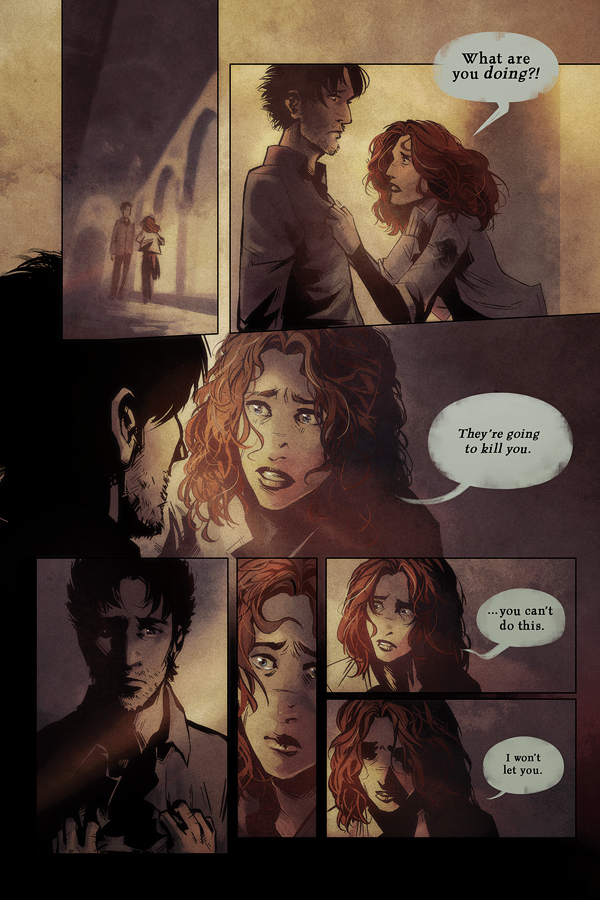
 She’s taking this quite well, I think.
—Working on maps and other bits and pieces of concept art this week. Hopefully I can post some of it soon! I still haven’t figured out how best to present extra world building info through the site yet – a wiki? Some sort of encyclopedia or lore section? I’d like to do something a bit more visually coherent than a wiki, but I think that might require more coding ability than my rather bare bones knowledge. ohhh weeelll
 She’s taking this quite well, I think.


 She’s taking this quite well, I think.
0 thoughts on “Page 285”
JD4780
Panel 2/4/5/6 – Nice work on the faces, the light vrs the detail is awesome.
Kyethn
Thanks. 🙂 I’m faffing around with my colouring method right now, so I think the shading’s becoming a bit more subtle which seems like it works really well with the diffuse lighting I’m trying to set up in this scene.
Hydrargyrum
The middle/background panel is very nice—love the atmosphere.
(Would make a great vote incentive without the speech bubble, too. 🙂
Slamlander
What I’m working on:
I have a similar problem to yours. I will be releasing novels on Kindle and POD (Print On Demand). Kindle has an X-Ray feature and it also allows links through WiFi.
I have extensive author’s notes on my internal Wiki and would like to link to them. The problem is spoilerage, creative control, and intellectual property. The solution that I am pursuing is a base wiki with selected pages transcluded out to an externally available wiki. Only I will be allowed to edit pages but the external pages will be readable by anyone.
Yes, the configuration is a little tech intensive but I’ve been doing software development for over 30 years. It’s a bit (lot) of work but it should be stable. One thing that allows this is that I am entirely self-hosted behind a decent ISP (Swisscom) so I have total control of the server environment.
Although I cannot demo yet (the servers are still being configured) it should work fairly well. If you want, we can connect and discuss it. Once the wiki is up, it is rather easy to maintain. The huge problem is spammers. Not making it publically editable is a major fix for that.
Personally, I favor the wiki approach and a simpler version of this worked well for ErrantStory as well.
Kyethn
I actually already have a wiki set up, but I couldn’t figure out how best to lay out information, and the difficulty of adjusting the visuals rather put me off. I think if this were purely a written project I’d definitely favour a wiki, but since a huge component is visual I’d like to approach it visually instead, especially since by this point I don’t think it’s inaccurate to say that I can display this kind of information better through art than through words.
Sometimes I wish I could just fill a sketchbook with art and notes and upload that. Hmm.
V
The sketchbook idea sounds really great actually! It would give us kind of an insider’s tour of your thought process and it would let us see the visual development of the world along with all of the information.
Slamlander
I have lost of sketches in my personal wikis and the have lots of imagery on http://www.errantstory.com/wiki/index.php/Main_Page
Yes, organization is key and another user called Graybeard and I spent a lot of time on exactly that issue quite some time ago, on the Heretic Knowlege Vault. I also wrote an entire sidebar compositing system for them. Once the foundation organization is in place though, it is easy to maintain. What we learned in those days is that you can not allow open registration, ever! Only Wikipedia has the manpower to counter spammers. Even Wikia, where Memory Alpha (a Star Trek site at http://en.memory-alpha.org/wiki/Portal:Main )is hosted, has continuous problems with spammers.
No matter which system you use, you are going to have to organize it somehow. There is no way around that. Now it is much easier to organize a wiki than just about anything else and I’m willing to help but as Michael Poe found out, it is not trivial no matter which approach you take. I am willing to help.
The visual thing is a canard, wikis can be quite visual and it certainly supports images of all kinds as you can see on both of the wiki’s that I linked to in this post.
Slamlander
s/lost/lots/ – damnit, I still can’t type!
Kyethn
Image support isn’t the issue, though I hope you realise that’s such a delightfully coder-esque way of interpreting what I said. 🙂 Obviously wikis can support various images and plonk them in next to the text, but I was talking about image integration, making the visuals work together in a design sense.
It’s more about design than anything else, and you have to admit wikis are quite constrictive in this area. I want to do something that’s really smashing in terms of the visuals. I’m struggling to find a good example of what I mean… maybe the character pages on Carciphona. I find it really neat that the character artwork is integrated into the website itself, and that you navigate through the characters by clicking on different silhouettes. I wouldn’t want to do something exactly like that for RMR, but the gist is there. Something a bit more than just a list of characters.
It also presents a different kind of organisational challenge – a visually led one rather than a more encyclopedic method. Ideally, in the end, I’d like to give the impression of a really strong, visual identity to the world, like you could just walk into it. Obviously you can do this (and exquisitely) with words and words alone, but I am an artist first.
Slamlander
You can actually do that with a wiki but it would be easier with WordPress integrated with Mediawiki. I’ve done it and there is a WordPress plugin that makes it possible. The other stuff you mention for look-and-feel issues are [not so] easily done with massive CSS editing. Unfortunately, the Mediawiki folks are really bad CSS coders. I’ve had to completely rip out Mediawiki’s monobook theme and rewrite it many times. It is basically uneditable. In fact it is one of the problems that I have now.
WordPress is tons easier but creating a custom theme for what you want is still a lot of work and wouldn’t transfer to Mediawiki unless, someone were to add theme support code to Mediawiki *sly grin* my problem is that I don’t have much time for that either. 🙁
There is a theme generator package for WordPress called Artisteer. It looks interesting but it doesn’t support Mediawiki* due to the aforementioned cruddy CSS code.
*Mediawiki is the software that runs Wikipedia.
Kyethn
Honestly, I’m thinking of going with a (relatively) simple HTML/CSS approach, I’m just not convinced that I need the functionality of a wiki or wordpress database. I’m not looking to build a massive resource of everything related to the comic, more just ambient setting information.
Particularly with all of the changes you suggested, I certainly couldn’t manage that by myself – I’d rather have something I can maintain and directly edit myself, since unfortunately I can’t afford to pay someone else to handle the more esoteric code-finagling duties. And it’s a lot of work for someone who isn’t being paid, alas.
Savail
Well, wikis or external resources that break the fourth wall don’t hurt anything (especially when they give the reader technically unnecessary but interesting and useful information); but if you want to take a more creative approach (since you are talented in the artistic department), you could always have one of the less prominent characters (or even someone completely unknown/unrelated) keeping a written journal/sketch log of their journeys and adventures. The included artwork is then explained as sketches and portraits included by them as they travel.
You can tell it’s been a long day after a sleep deprived night when there are three sets of () in one sentence…
Savail
Addendum: For sheer laziness, I’ve preferred using SimpleViewer the past few years to handle gallery aspects. For something so low resource requiring, it’s surprisingly configureable and has a nice, clean, simple (obviously) appearance. At one point, when I was exporting book pages to image files, I even used it as a book viewer (very VERY customizeable layout).
Slamlander
I don’t blame you there. I was only answering your project concerns. What you want is far from simple even if it sounds like it isn’t. However, I still think that the WordPress approach with a custom theme may be your quickest way towards implementation. I’ll give you a quick clue, you are not currently using WordPress features to their full capability. Check out what James Roden did with Requiem (http://requiem.spiderforest.com/). Inparticular, check out how he used categories to index his archives by character plotline. All he did was to assign a character name as a category to each page, listing all the characters that make an appearance on that page. Clicking on the category tag ’targeter’ (a character) gets you only those pages with Tarhgeter in them like so (http://requiem.spiderforest.com/?tag=targeter).
Kyethn
@Slamlander Well, I’ve made loads of sites like this before so I don’t think it’s going to be too much of an issue. I’ve also used WordPress enough to know it’s not really what I have in mind for this. It would take just as much time to do it either way, and I don’t need a database of blog posts, so…
I’m also nooot reaaaally a fan of that categorisation you brought up. I get that it’s an option, I just don’t see the point at all. Also it’s a ridiculous amount of work to go back and tag each and every page, that’s time that I’d rather spend doing almost anything else. Do people actually find that sort of functionality useful?
@Savail Man, ran out of nested comments. I think that’s the sign of a conversation gone way too far. Anyway, I actually did something like that for a final college project and it seemed to go over pretty well. So…maybe?
Crestlinger
Push the pyro over the edge, ready the BBQ and stand well back.
Kyethn
hope you all brought marshmallows
avstron
I think you can work it quite well in this platform like Jenny did on the Encyclopaedia in The Zombie Hunter comic!
Kyethn
That’s a good point, actually. I chat with Jenny pretty much every other day and I never thought to bug her and Greg about this sort of thing. I shall investigate!
Slamlander
Marshmallows to hand and some bratwurstchen as well 😉
However, I though the Colonel was also a fire mage. One thing for sure, he not only out-powers her but he knows it, in detail.
Renshou, on the other hand …
Andreas
Wasn’t he an everything-mage? Or at the very least a lots-a-stuff mage.
A facefull of sigils…
avstron
Mind you, Wiki is one of the most versatile websites for this kind of things, but it’d be difficult to achieve visual coherence even with coding super-powers.
alala
For pete’s sake, Lethe, you’re going to throw away your life for that…er, that woman for whom I have no suitable name? Take a cue from Adrianna, seriously.
And I like the 1st panel of Adrianna running. She looks kind of adorable, for some odd reason >___>
Kyethn
The thing is that Danil’s clearly a threat to Adrianna here as well. Danil’s basically corralled everyone that Lethe cares about in to one easily exploded area. So…
Wulfgar
I adore your art. It has a special warmth to it. I can’t
really articulate why, but it makes me feel good. I often
return to the same page, letting it unfold. I’m grateful
that you are sharing this story and hope you it will be
enjoyable for you to tell it furthermore in the future.
Kind regards from south europe.
Kosake
That’s not warmth, that’s Adrianna building up heat…
Karoliina
Thanks for the great comic!
Sincerely yours
Long-time reader from chilly Finland
codeman
sweet drawing skills. figure drawing level up!
Kostas
Light in this and next page is fantastic. It’s always good, though:)
Recent Posts
Recent Comments
Archives
Categories