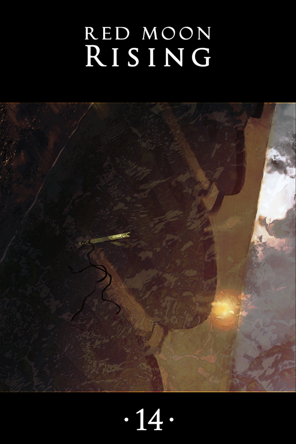
 Things that are hard to draw:
Architecture
Reflections
Water
Perspective
Architecture reflected in water at a wonky angle
This is the most difficult thing I’ve painted since that damn airship from chapter 9. The worst part is that it’s all my fault. My secondary concept for this cover was Danil giving a thumbs up with a toothy grin, though, and I didn’t feel it had that… you know… je ne sais quoi.
Though by this point I’ll just be pleased if the cover reads as anything at all.

0 thoughts on “Chapter 14 – Cover”
Ink
It took me a second, but I recognized it for what it was.
I wanna see that alternative cover, though. It’s a matter of international security.
Kyethn
JacaByte
I don’t think that would have conveyed the same mood as this cover.
Kyethn
Too subtle?
JacaByte
I dunno, this cover (once you see the reflections, it’s beautiful!) is great because of its abstraction. You get a sense that something happened to Lethe.
Danil giving you a thumbs up just comes off as a bit creepy… Is he trying to tell us “Mission Accomplished”? Or is he giving a thumbs up to somebody who’s standing behind us?
Nonetheless I got a good laugh out of Danil. 🙂
Kyethn
Spoilers: I was never planning on going with Danil on the cover.
thatsthejoke.jpg
Pseudonym
If “thatsthejoke.jpg” isn’t the filename of the mock thumbs-up cover image, I hearby lobby that it should be.
Andreas
Did you consider making a reflection of architecture in Danil’s teeth?
Maybe that would have helped?
Or parsley… parsley adds class, I think.
Oh wait, it doesn’t.
Yeah, I think you did good in going with the water… less risk of parsley.
Pseudonym
Hahaha, awesome.
OneWingedAngel
At first I thought the little data-stick was falling from a great height, most likely that damn airship from Ch. 9.
Kyethn
stupid airship ruining everything
Glennnn
Ooooo. Its like you’ve gone either abstract expressionist or super photo realist. It works one way or another, or both.
Maybe you should just be glad it isn’t raining(!)
And I do miss those airships…
Great chapter cover page.
Kyethn
I honestly did consider adding rain, but then I realised I would like to finish this cover some time this decade without going entirely mad, so…
Joel
If you ever decide to put this series into print, I’ll be all over it.
Just sayin’
Rachel Muir
Yes, I agree
DanialArin
The whole grail of computer generated imagery is the accurate presentation and portrayal of hair, cloth, fire and water. It makes sense that these same things would give a traditional artist some difficulty.
Andreas
Whole grail – the holy whole-grain grail 😀
Sorry, I don’t mean to pick nots – that was just too beautiful to pass up on.
Kyethn
…I think you mean “pick knots”.
GLORIOUS PEDANTRY \o/
Andreas
Yes, sorry… I meant “pick knits” … or gnats?
Heeberjeebers?
Kyethn
Hoobajoobers.
alala
I dunno. I might actually have preferred that Danil cover. Not the same mood, given, but it’s…pretty…awesome. And hilarious. 😀
PLEASE POST IN GALLERY?
Pseudonym
Oh my god I just saw it. It was like a Magic Eye poster or something, previously I’d just sort of been seeing shapes in the reflection, and then suddenly I blinked and saw the archways and columns and, wow, yeah, it’s really quite beautiful.
Kai
It was only after reading your comment that I saw the archways and columns! And yea, gorgeous! (:
Glennnn
Ha ha ! That’s just Rose having a bit of fun with your brain ! !
Kyethn
I kinda like that it turned out this way. It was such a hassle to paint and I couldn’t decide whether or not the concept was going to work at all until I was done. I hadn’t even decided whether I should post it like this or upside down. I think it’s sort of neat it turned out… not quite apparent at first glance, but hopefully still a compelling image?
Glennnn
Yes. Its packed with goodness!
However, someone just starting with the story might have some head-scratching moments since it borders on disorienting vertigo!
Knowing something about that place is a key to deciphering the image so that it snaps into a cognative form.
A sophisticated vision!
Slamlander
I had to come back to it a few time. I purposly stayed away from this forum so that I could see it for myself. The hint that it was a reflection on water helped. 😉
Very subtle cover (applauds).
Note: If you look at my avatar, the shades (sun glasses) also reflect an image and on the original, you can also see a hint of the eyes behind the shades.
Ragnheiður
Hiya! Just found your comic today and read it all through! It’s really great and you have a very interesting and cool style of drawing. Love how you use kind of rough backgrounds that still tell everything that has to be told.
Keep this wonderful work up!
Oz
Getting extra mileage out of the cliffhanger, nice. Mean as well, but nice…
Recent Posts
Recent Comments
Archives
Categories