
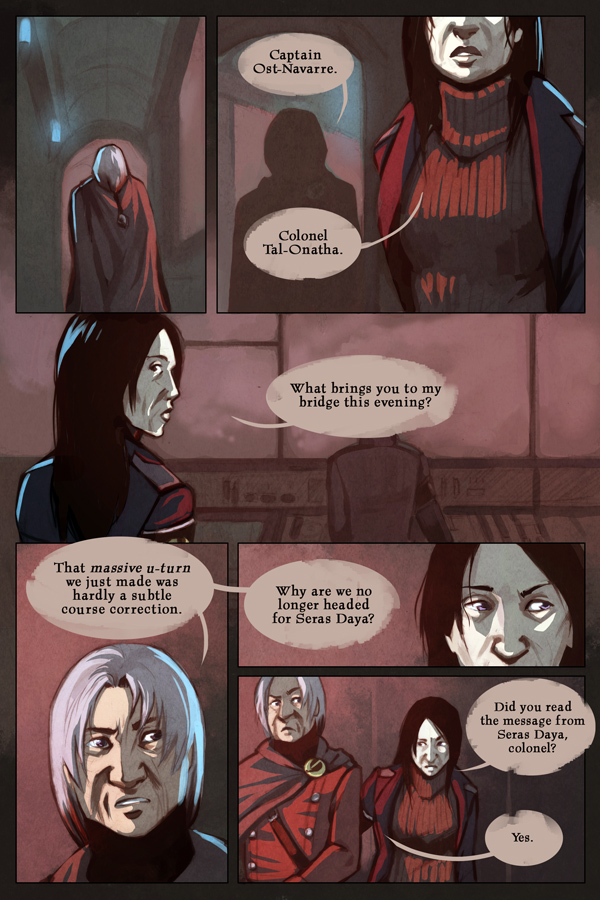
Sorry for being a bit absent in the comments recently, I’ve been struggling a bit just to keep on top of updates. Halfway through this one I had an idea to snazz up the lineart which involved basically adding greyscale toning to the lineart layer while continuing on as usual with the colouring. You can see what I mean a bit more clearly by looking at lineart by itself here. I think it’s added a level of detail that I’m quite pleased with, though messing about with it was a bit time consuming and delayed the page a bit. Sorry! Still trying to get a buffer going… Improvement, yay/nay?
New vote incentive (finally) – I painted a thing and the yeah I like painting and stuff. It’s a faaaaace.
0 thoughts on “Page 134”
Prestwick
I’m a fan. Its almost like something out of 2000AD. Panel 4 is my favourite.
Kyethn
Awesome! I was actually thinking of 2000AD while I was working on it, there’s some mad awesome art in there.
Seanan
Looks good to me! Although, it looks like the colonel dyed the tips of his hair in that one panel with only his face, hehe.
Kyethn
Haha, I see what you mean. It’s just how the lighting turned out, really…
jackjaques
Just read through your archives, and I got to say: love your artwork!
Kyethn
Thank you!
elle
i’ve read the whole thing, and i like the characters and the art, and i -think- i know what is going on, but to be honest, i’m never really sure…
Kyethn
I’m never very keen on outright explaining things, I prefer a bit of mystery in the plot so… I think this is normal? I think? Hope you’re enjoying it regardless. 🙂
Slamlander
Yes it looks good. Improvement, maybe. Definitely different. Brings out the highlights more.
Does it take more or less time to do?
Kyethn
It takes about the same amount of time to do, as I spend less time refining the inital pencil work and drawing backgrounds since a lot of that is taken over by the greyscale shading. And it’s certainly a lot more satisfying, I love painting.
KatieD
Colonel’s lookin’ good in panel 4. 🙂
Kyethn
Awww yeahhh
Pseudonym
I like how you designed the captain to look like she comes from the same environment as the colonel. Not related to him or anything, but the same pasty skin and general build that marks her as a product of the same military establishment in a big, dank city.
Kyethn
Glad you think so. 🙂 I wanted to make sure she looked fairly weathered in a similar way to Danil, as I can’t imagine climbing to that sort of rank is too easy on a person.
Yara
“That massive u-turn we just made was hardly a subtle course correction.” Win.
I love what you did with the coloring on this page. I don’t know how to describe it exactly, but It made everything so much more vivid and smooth and 3D-like. I especially like this effect on characters’ skin, IMHO it makes the texture feel much more, well, skin-like. 0.o
Kyethn
Great! I think I’ll stick with it for the next while, see how it goes. 🙂
Albone
I think the art is fantastic as ever, but is there any reason you add the grayscaling to the lineart layer, rather than say, it’s own layer?
Kyethn
Saying it’s on the same layer as the lineart is maybe a bit misleading since how I generally work is the same way I do a painting – I have a base layer and then a layer I paint on over it. If I like what I’ve done on that layer, I flatten it all down and make a new layer to paint on. In the end the lineart does end up being on one layer, though, since I need to have it set to multiply to colour underneath. Also, for me there’s a certain mental clutter going on when I have unnecessary layers floating about, not to mention the fact that it slows Photoshop down.
Recent Posts
Recent Comments
Archives
Categories