
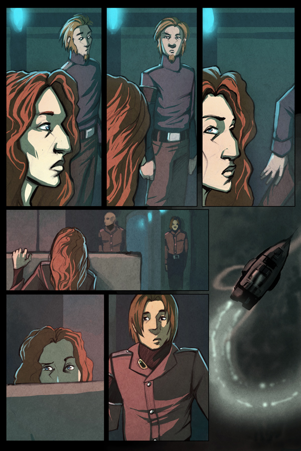
Wow, this page was so much more hassle than it looks like. I think I spent a total of six hours just trying to figure out the thumbnail for it, which is almost as long as drawing the stupid thing took. That is a lot of time to spend drawing tiny boxes. For some reason I just got a huge mental block on it, so sorry for the delayed update. It was not for lack of trying. D: (Also, I still hate drawing airships.)
In other news, I was interviewed on the TGT Webcomics podcast! It was loads of fun, and also quite interesting. At least, I hope so. Ironically, I spend a lot of time prattling about the importance of updating on time, so if you want to hear me being a giant hypocrite, you won’t want to miss this! Ohhh yeah!
I think I’m forgetting something important, but also it is 4am, so screw it.
0 thoughts on “Page 133”
silleri
I just see what’s going on in her head!!
Kosake
From a completely non-artistical point of view (best thing I can draw are structure formulas): I think the page lacks some detail… What I really like about your style is it’s immersiveness. You somehow manage to convey what every texture, every wall and every fabric feels like, at least it works great for me. But this page seems a bit… clinical. Like old comics or something, I dunno… I guess, it took you long enough, so I am not the one to complain. Maybe its some of your recent tweaks to the procedure, wich just appear more clearly on this page… Better get a second opinion from someone who can actually draw something for this one.
Kyethn
Hey Kosake, I don’t know what to tell you… I didn’t do anything differently here compared to what I’ve been doing for the past four pages or so, and I’m really straining to see what it is you’re referring to. I don’t suppose there’s any way you could elaborate at all?
Kosake
I’ll try… For one thing, Adriana’s face seems somehow different. Not the features but… I dont know… maybe the paint looks a bit non-organic somehow. Also, you made some better drawings of Galak than the one in the sixth picture. Frankly, I liked mondays scetch better.
Hum… Must be a pain to figure out, what I mean from that…. If you don’t see anything, just ignore it. I’m probably to tired to see straight myself right now.
Mel
I agree – there is a ’clinical’ or flat feeling to this page compared to previous. The first ~three panels are a close-up of the heroine’s face, and so deserved a more subtle build-up of highlights and shadows, or at least a softer gradation between the two values.
But what do I know. Someone else thinks those panels are “so damn awesome”.
fyi. the airship you hated drawing is so damn awesome.
Kyle
I think what you’re getting at is that the colors have changed slightly; whereas the last few pages have been more shadowed and desaturated, the colors here are much more crisp and bright, as though there’s an extra flourescent light been turned on. I like it; yeah, it’s a little flatter than the other pages, but that feels more realistic to me for the cold, metal insides of an airship.
Kosake
What he said….
albone
Wow, you really nailed that last panel. Love the smoke trail it left in it’s wake. Panel 6 is pretty fun, and the whole thing rules of awesome color.
Calaros
Panels 1-3 are so damn awesome.
incendere
I love her face in profile – she has such a great nose.
Other than that… I stumbled across your webcomic recently, and I’m really looking forward to reading more. (It’s given me the kick I needed to pick up old sketches and try to actually get something on paper, so thank you!)
Shin
Wonderful as always!
I look forward to more, and fyi I like your one year sketch >>
KatieD
Love that exchange of glances between Adrianna and Galak and the end, with the raised eyebrow and the shrugged shoulders. So realistic – she looks around for a clue to what’s going on, doesn’t see any sympathetic faces, then latches on to the one guy she has some rapport with.
dray
Pff, I don’t know if the page is ’lacking’ anything like the folks above had said. It just looks like you had been using less gradients and more flat shapes as opposed to a more painterly technique. It probably just jars them to see that AND a lack of spoken words — those two in combination can make it seem like there’s a pretty big leap.
Recent Posts
Recent Comments
Archives
Categories