
Ffffffffffffffffffff… It’s pages like these that make me wonder why oh why I decided a steampunk style comic, airships and all, would be a good idea. Especially airships that dock at awkward angles, therefore necessitating horrendous amounts of perspective drawing. This is probably the most difficult thing I’ve ever drawn, and I really only have myself to blame.
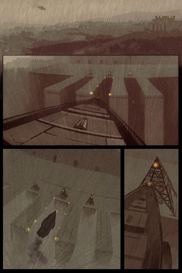
So here we go, the airship finally arriving in Seras Daya. Also, sorry if anyone was expecting that last scene to go on longer. As if I would actually reveal details about the plot, how preposterous.
0 thoughts on “Page 148”
Arzadon
The airship looks a little weird in the last panel, but it could be me. But I do love the style of the comic. The steampunk, and magic mix is extremely interesting. o:
Pandarsenic
I actually didn’t notice it at first, but now that Arzadon pointed it out, the airship seems a little wonky last-panel, until you look at it again and realize it’s REALLY freakin’ big and it’s still up above the tower and the lights in the panel before.
In all fairness, I think this is the first thing thing that’s thrown me off about this comic’s art, I didn’t notice until someone pointed it out, and every other element of art (even the other panels here) look friggin’ fantastic all the time.
The first panel makes me happy inside.
<_< Also, I wonder what this comic looks like without the rain.
Kyethn
Urrrr, I’ve poked at the last panel a bit but I really can’t see the wonkiness you both mentioned. This page took such a long time to plan and draw that I think I’m just going to leave it since I can’t figure out where the problem is. Sorry. D:
Anyway, thanks! Also, ask and ye shall receive: http://img.photobucket.com/albums/v398/siovin/134_19.jpg
Arzadon
I never realized the rain made such a difference. o.o
Pandarsenic
Whoa, the wonders of Layers. Fascinating.
Also, the reason it seemed off at first was that in the third panel, I thought the dock’s lights were the same elevations as the ship’s lights, which is clearly not true as the ship is level with the tower in the fourth panel.
Then I realized: No, the ship is above and still a bit to the right. This is why it looks like it’s in the center of the lights (which are necessarily lower than the light on the ship, which is what I had been judging by). It moves forward and a bit left to line up for the fourth panel.
I think.
Lans
It might just be me, but the airship kinda looks like an Imperial Star Destroyer.
squidmaster
If it’s any consolation, it still looks gorgeous. <3 I love love love the grainy effects you use; it gives the atmosphere so much depth. And you have stunning control with contrast… *envy*
Hellephant
Hey there, long time reader, first time poster =P
I’m just chiming in with the usual ’I love this comic and your artwork’ as well as to say that I didn’t find the last panel to be awkward at all. As Pandarsenic said, the bottom of the airship is in line with those eight docking lights, and the bow is exactly in line with the light on the metal mooring pyramid.
Bintopo
I think it works just fine. It moves the story forward and that, to me is what it’s all about. That’s why I read them and leave the drawing to you, the expert. 🙂
Ramsus
This is a thing of beauty.
Pritch
I think the awesome that is the first panel negates anything that may be off in the last one.
booper101
😀 Awesome! I like how this comic turned out. Very coolio. Wow, I didn`t think the rain made much of a difference but it did! Keep up the good work Rose!
Rajaat
I don’t really see anything wrong with the last panel. o.O
I love this scene. It’s amazing.
Michael
I want to give this scene a slow dirge or something solemn like a single clarinet played in a slow tempo with only the sound of the rain rushing as background noise. Mmm.
Jan
Jumping on the bandwagon – weeks late of course – The perspective shift in panels 3 & 4 confuses because the black silhouette gives an erroneous impression of the airships size, proportional to the dock. Panel 2 to 4 is much easier to follow in the mind’s eye – but I love me them rainy & wacky perspectives, so please don’t take this as criticism except in so much that as a redundant QC kinda guy I can’t help myself from picky at artwork I love. *bows* *and breathes* 😉
Jan
Oh, and I am so cribbing this for my Victoriana/Castle Falkenstein/Ravenloft games (yes they all are different games, not one evil mix of mega gothic steampunk, in the rain). 😀
P.S. I meant ’picking’ or possibly ’being picky’ in the previous post. Gotta watch that writing 😉
Glennnn
Nothing wrong with it… better than too much fussing with it because when you see that the viewing perspective gives objects proportions that are misleading this is more like real life (where this happens all the time!) If you only had one frame to tell the whole action of docking that would be different. I like successive approximation.
Glennnn
Just looking at “that damned ship” again, and The First Thing I Noticed was that you wasted all that effort because…
NO airship captain in his or her right navigation mind would attempt an approach (especially in weather with limited visibility) without first adjusting the altitude so the ship and the docking queys are at the same height. Weird Perspective Problem SOLVED!
There would be no strange angular difference between the ship and dock because they would be at the same level- calling for a normal and typical perspective-line for the entire drawing.
-You really should travel more often by airship-
Kyethn
*shoots self*
Recent Posts
Recent Comments
Archives
Categories